




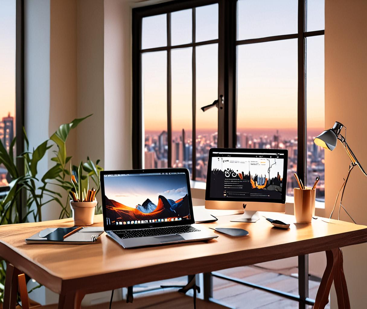
Discover 10 proven design secrets for a stunning portfolio website that boost personal branding and wow visitors.
Why Most Portfolios Fail (And How Yours Can Win
Imagine a hiring manager scrolling through a sea of portfolios in under a minute. One glance, one decision: keep or discard. The odds of yours being the one that stays are tiny—unless you design it like a museum exhibit, not a cluttered attic.
1. Lead With a Hero Section That Tells a Story
A bold hero image or video paired with a concise, punchy headline instantly communicates who you are. Think of it as the cover of a book—if it doesn’t intrigue, the reader won’t turn the page.
Use a single, high‑impact project thumbnail and a 10‑word value proposition. Less is more.
2. Keep the Layout Grid Simple
Three‑column grids feel safe, but they often waste space. A 12‑column system lets you shift from full‑width hero to 2‑column case studies without breaking rhythm.
| Layout | Best For | Typical Use |
|---|---|---|
| Full‑width | Visual storytelling | Landing page, hero |
| 2‑column | Project details | Case study, blog preview |
| Masonry | Creative variety | Portfolio gallery |
3. Prioritize Visual Hierarchy
Size, color, and spacing guide the eye. Bold titles, muted captions, and generous white space create a natural flow from headline to project thumbnail to description.
“A well‑ordered page feels like a conversation, not a lecture.”
— Design Director, CreativeCo
4. Show, Don’t Just List
Replace bullet‑point skill lists with short video clips, before‑after sliders, or interactive mockups. The audience sees the result, not just the resume.
A 30‑second project walkthrough can replace a page of text.
5. Use Consistent Branding Elements
Your logo, typeface, and color palette should echo across every page. Consistency builds trust and reinforces personal branding website goals.
6. Optimize for Mobile First
More than half of portfolio traffic now comes from phones. Design thumb‑friendly navigation, stack columns vertically, and keep load times under three seconds.
Avoid hover‑only interactions; they disappear on touch screens.
7. Add a Personal Touch
Include a short, candid video or a handwritten note image. It humanizes the personal branding website and makes you memorable.
8. Curate, Don’t Hoard
Show only your strongest 5‑7 pieces. A focused portfolio layout tip beats a sprawling gallery that dilutes impact.
Rotate projects every 3‑4 months to keep the site fresh.
9. Include Social Proof
Testimonials, client logos, or a press badge strip add credibility. Place them near the end of a case study where the narrative peaks.
“Seeing a familiar logo next to a project instantly raises trust.”
— Freelance Illustrator
10. End With a Clear Call‑to‑Action
Whether it’s “Schedule a chat” or “Download my resume,” the CTA button should stand out in color and be repeated on at least two pages.
Take the next step: sketch a one‑page wireframe that follows these ten secrets, then swap out a single element each week. By the time you’ve refreshed all ten, your portfolio will feel like a living showcase, not a static resume.